Earlier this year, I had the pleasure of working with Joy O'Conner of EARTHENjoy on a little branding and packaging project. This was not a full blown branding project, as Joy already has some great branding pieces in place. We took what she already had and made some additions to make her branding and packaging even better moving forward.
EARTHENjoy is ceramic jewelry handmade by Joy. She cuts, smooths, fires and paints all of her pieces. The result is gorgeous handmade ceramic jewelry that you will love for years to come.
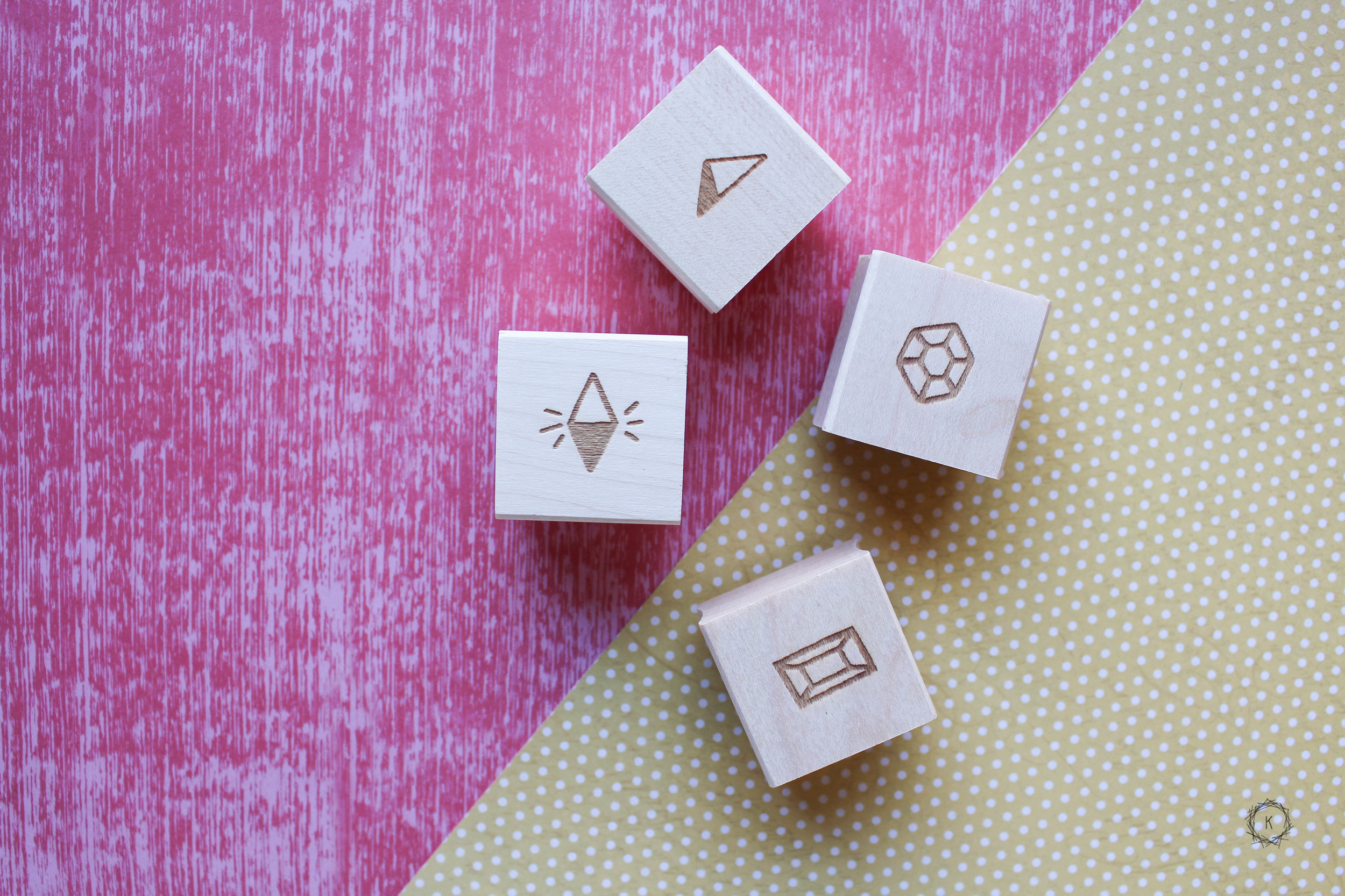
A lot of pieces from EARTHENjoy have a geometric feel. Many of the earrings, necklaces and wares, are in geometric shapes or have faceting that give them a very geometric, yet organic, feel. We took this geometric element of Joy's work and incorporated it into some branding, and packaging additions that will add a special touch when sending out her goods.
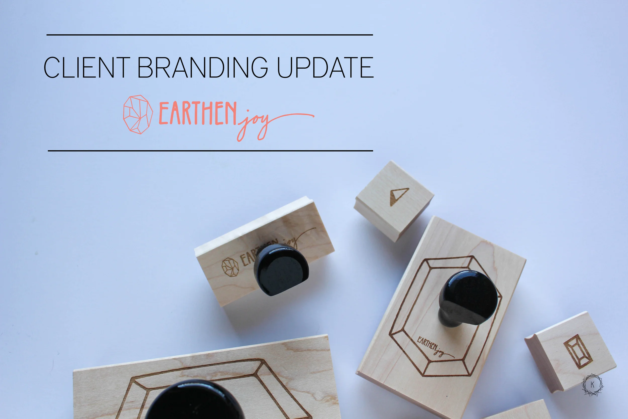
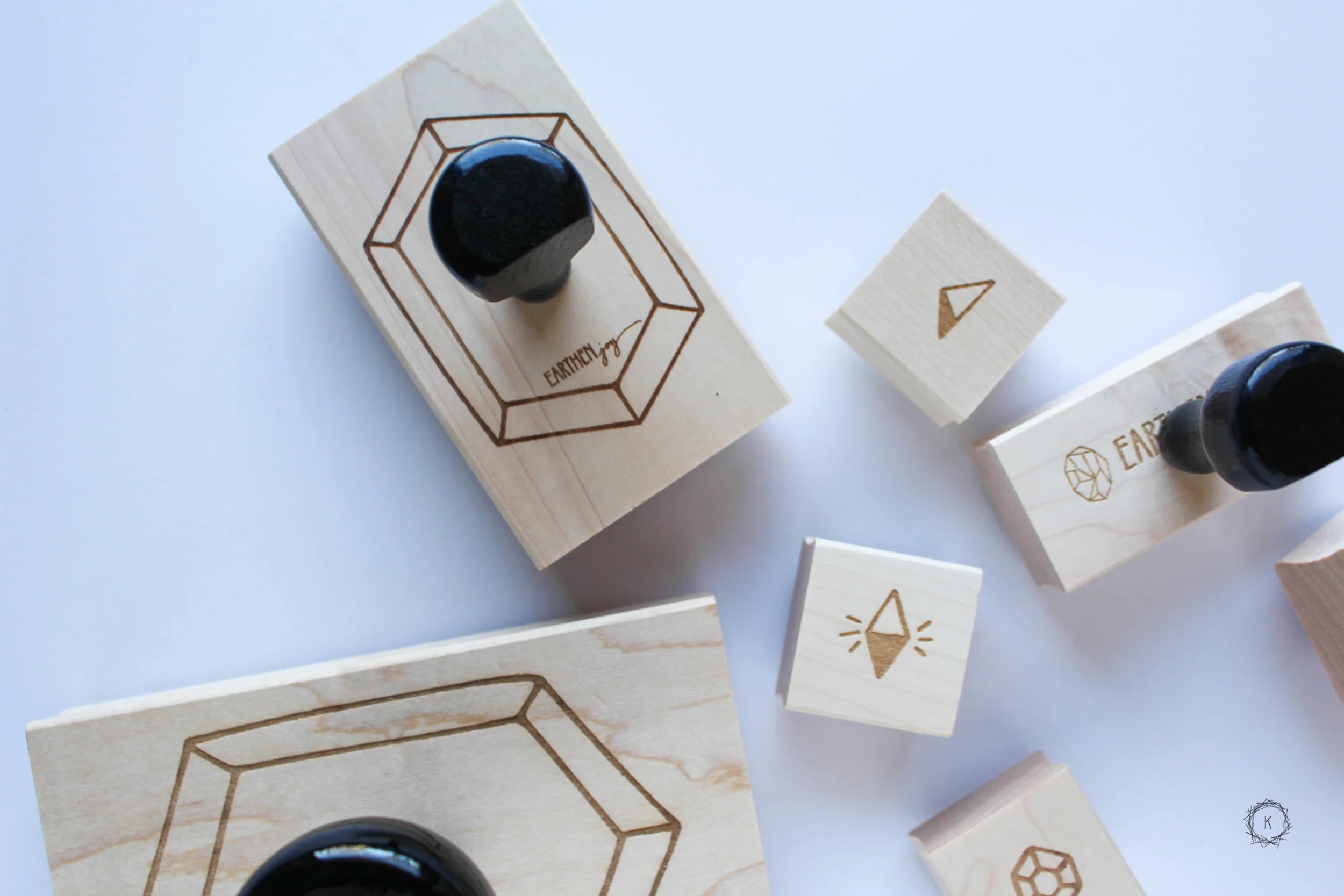
We created stamps, and icons that can be added to packages going out in the mail, or when goods are boxed up at the various markets EARTHENjoy participates in. We also created large functional stamps that can be used on fun paper as earring backers, and thank you notes.
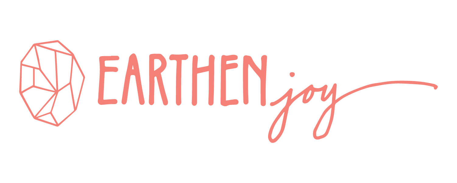
Lastly, we added this gorgeous geometric shape to Joy's logo! Adding this icon, furthers her brand while keep the logo and branding her customers know and trust. Overall, we just boosted and furthered the branding Joy already had in place. By creating functional pieces and designs that can help her continue to grow her business.
Interested in this gorgeous ceramic jewelry? Find Links to EARTHENjoy below!
EARTHENjoy Instagram // Shop EARTHENjoy // EARTHENjoy Website // EARTHENjoy Facebook
Are you a business owner interested in branding, have graphic design needs, or need help with packaging? I would love to chat with you, and help you create something that meets the needs of your business. Let's Get Started!
